Knowledge & expertise
3 min read
Why brand consistency is the key to revenue, trust, and efficiency

Written by
Ian Torenvlied
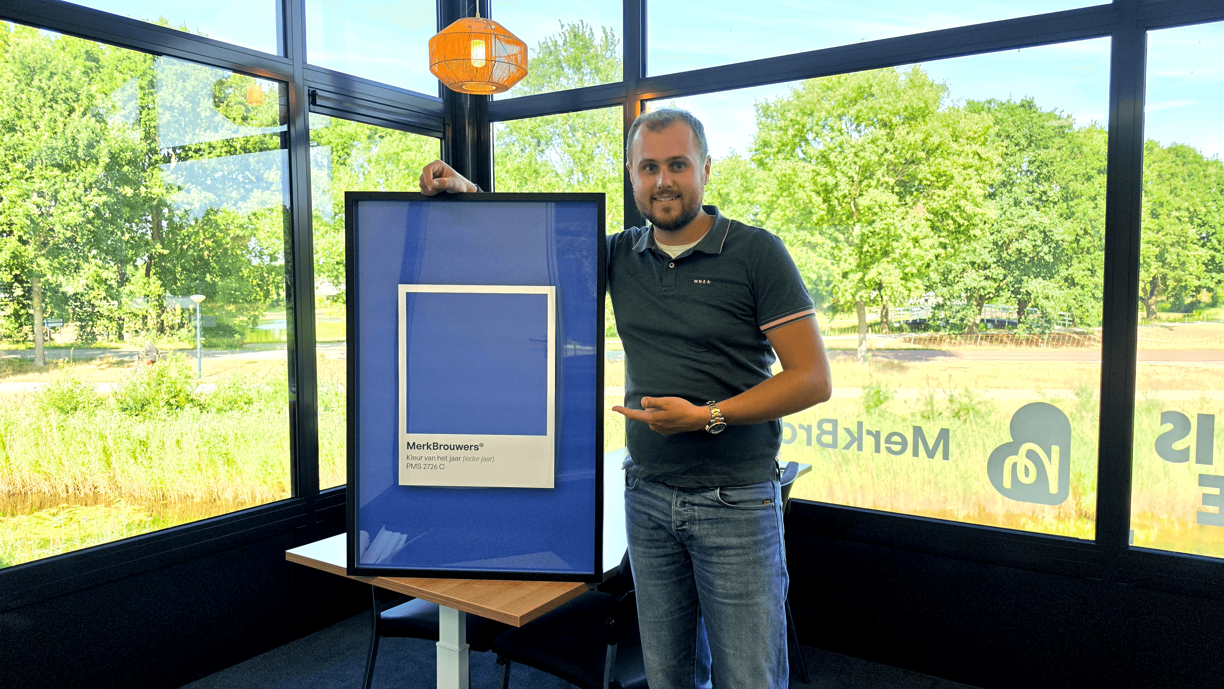
Many SME companies in the Northern Netherlands have experienced impressive growth in recent years. Great new colleagues are joining, branches are expanding, and services are growing happily along. But as the organisation scales, the visual appearance does not always automatically keep pace. This creates what we at Merkbrouwers call: a colourful collection of expressions.
The scenario is highly recognisable: an enthusiastic sales colleague quickly creates a PowerPoint presentation using an older logo, administration is still using a previous template for invoices, and on LinkedIn everyone uses a slightly different shade of blue. Understandable, as everyone is busy, but a waste of energy: a unified appearance actually provides peace of mind, recognisability, and trust for your customers.
Three valuable benefits of a consistent appearance
Building trust: A customer chooses certainty and professionalism. When an organisation radiates the same familiar quality and peace of mind everywhere, the collaboration immediately feels solid and reliable.
Time and convenience for the team: How much time do colleagues lose weekly searching for the right file or the correct colour code? With a user-friendly brand library and handy templates, everyone grabs the right layout in just two clicks. That makes working so much more pleasant.
Optimal return on your brand: You have invested in a beautiful brand identity. By helping colleagues easily apply that style, the brand continues to shine just as powerfully and recognisably everywhere.
Practical example: The Brand Check
When we, as a friendly brand partner, look along with an organisation, we map out all expressions clearly. This is what a practical improvement step looks like:
Point 01: Logo update on Social Media (Priority: High)
Observation: On the LinkedIn page, an earlier logo variant with a different shade of blue is still being used.
Opportunity: To create unity with the updated website, so visitors immediately recognise the trusted appearance.
Solution: Simply update the profile with the official files from the online brand library.
Point 02: Consistent quotation templates (Priority: Medium)
Observation: Different team members each use their own font and layout in documents.
Opportunity: Leaving a polished and professional first impression with new enquiries.
Solution: Setting up a user-friendly Word and presentation template in which everyone can immediately work flawlessly.
Smart digital support
To make things as easy as possible for teams, we deploy smart digital tools that watch and help in the background:
The Collector: Automatically brings together all public expressions (such as social media, websites, and signatures) in a clear overview.
The Brand Guide: Identifies where colours or fonts deviate slightly from the brand guidelines and provides handy suggestions.
The Brand Assistant: Bundles points of improvement into a clear, friendly overview with ready-to-use tips and templates to get it right immediately.
Sustainable and user-friendly brand convenience
As a B Corp Certified design agency, we believe in sustainable, future-proof solutions. A brand identity only really works if it is fun and easy for everyone in the team to work with. We build accessible, clear brand environments and handy templates that last for years, so that everyone can convey the same beautiful message with pride and pleasure.